A New Design
I've been using Octopress as a blogging platform for over six months now, and can't recommend it enough for tech capable (or curious) writers. However, I've never been fully happy with my minor adaptations to the default style. I finally got around to implementing an improved design.
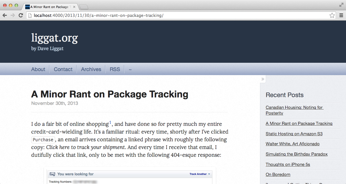
Original
My site started off looking like this:

It was by all means serviceable, but I was starting to tire of the excess chrome - the prominent header, the large nav-bar, and the unnecessary Recent Posts sidebar. Morever, despite numerous tweaks to the layout, colouring, and typography - it still instantly looked like an Octopress site1.
Design Objectives
I'm not a UI designer, either by trade or by realistic-aspiration2. Still, I had a pretty good idea in mind what I wanted my home on the web to look like.
- Content Focus: This site exists for one purpose - a place to store material that I write. Anything that's not written content distracts from that objective. Among other things, that means the large, colourful header needs to go.
- De-Octopress the UI: Octopress is the infrastructure for this site, and will be for the far-foreseeable future. That doesn't mean I need to rely on its default UI styling, and in fact, I'd greatly prefer it didn't look like an Octopress site. I still want to rely on the basic Octopress layout though, as well as its responsive design.
- Better Typography: I've long been a little too zealous in observing the 'rule' that sans-serif headers should be paired with serif body text. Accordingly, I initially used the serif Google Font Lora for the body, but was never quite happy with the choice. Many blogs I read eschew serifs entirely, and the effect is well-suited to the content3.
- Better Footnote Styling: Chris Suave's excellent Bigfoot footnote implementation is far superior to numeric in-page anchors. I wanted to replace the latter with the former (or similar).
Result
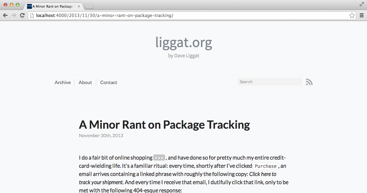
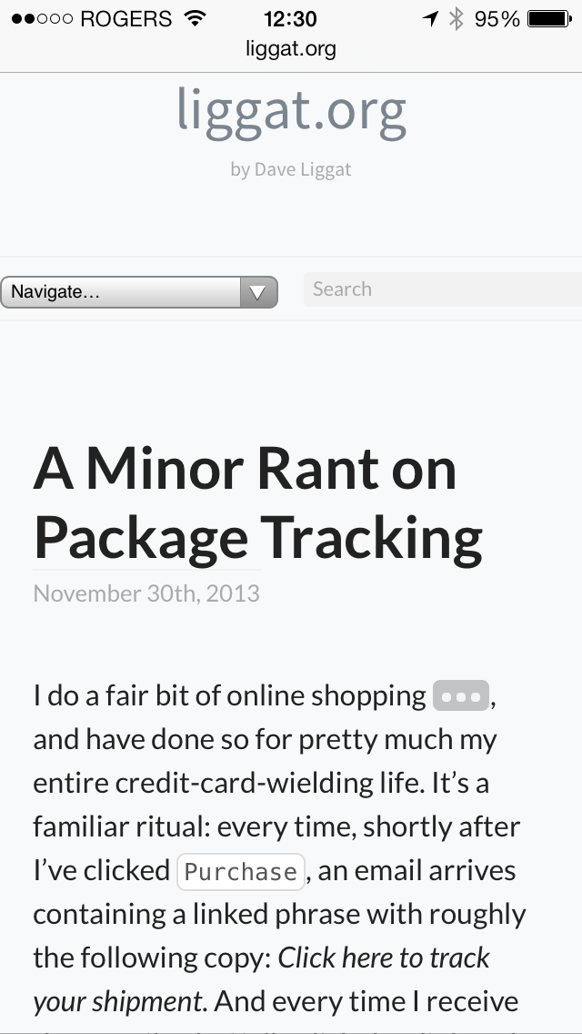
With a bit of spare time over Christmas 2013, I hacked away at my blog's git repo to shape the design. I'm pretty happy with how it's turned out:
Desktop Layout:
Mobile Layout:
I'm still a bit ambivalent about having comments at all, but otherwise, I'm happy with how it looks. It'll be interesting to review these design decisions down the line.
-
This style is instantly recognizable around various corners of the web - all deriving from the design on octopress.org itself. The gradient and text-shadow on the nav-bar is a dead giveaway. ↩
-
I have just enough design knowledge to overcome the Dunning-Kruger effect. ↩
-
i.e., we're not writing the New York Times here. ↩

